/**
 * Shared Game Header Component
 * 
 * Standard header layout for all games with:
 * - Left: Home button + Back-to-setup button
 * - Center: Title block + Rotate message (portrait only)
 * - Right: Game control (play/pause) button
 * 
 * USAGE:
 * 1. Import this file:
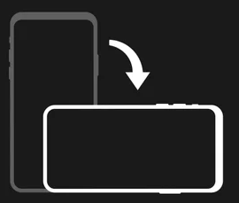
 <link rel="stylesheet" href="/static/shared/game-header.css">
 * 2. Use the standard header structure (see below)
 * 3. Add body.game-active class when game is in progress
 * 4. Add portrait-mode detection JS (see below)
 * 
 * HTML Structure:
 * <header>
 *     <div class="header-row game-header">
 *         <div class="header-left">
 *             <a href="/" class="game-home-btn" title="Back to Home">🏠</a>
 *             <button class="game-back-btn game-active-only" id="btn-back-to-setup" title="Back to Setup">⬅️</button>
 *         </div>
 *         <div class="title-block">
 *             <a href="/" class="home-link" style="text-decoration: none; color: inherit;">
 *                 <h1 id="page-title">🎮 <em>Game!</em> 🎮</h1>
 *             </a>
 *             <p class="subtitle" id="page-subtitle">Subtitle text</p>
 *         </div>
 *         <div class="rotate-hint">
 *             <img class="rotate-icon" src="/static/assets/rotatescreen.png" alt="Rotate">
 *             <span class="rotate-text">Rotate for best experience</span>
 *         </div>
 *         <div class="header-right">
 *             <button class="game-control-btn game-active-only" id="btn-header-game-control">⏸️</button>
 *         </div>
 *     </div>
 * </header>
 * 
 * Portrait Mode Detection JS:
 * function checkScreenOrientation() {
 *     if (window.innerHeight > window.innerWidth && window.innerWidth <= 1024) {
 *         document.body.classList.add('portrait-mode');
 *     } else {
 *         document.body.classList.remove('portrait-mode');
 *     }
 * }
 * checkScreenOrientation();
 * window.addEventListener('resize', checkScreenOrientation);
 */

/* ============================================
   GAME HEADER LAYOUT
   Uses CSS custom properties from breakpoints.css
   ============================================ */
.game-header {
    justify-content: space-between !important;
    display: flex;
    align-items: center;
    gap: var(--header-gap);
    padding: var(--header-padding);
    position: relative;
}

.game-header .header-left,
.game-header .header-right {
    display: flex;
    align-items: center;
    gap: 8px;
    min-width: 80px;
}

.game-header .header-right {
    justify-content: flex-end;
}

.game-header .title-block {
    display: flex;
    flex-direction: column;
    align-items: center;
    flex: 1;
}

.game-header .title-block h1 {
    font-size: var(--header-title-size);
    margin: 0;
    line-height: 1;
    white-space: nowrap;
}

.game-header .title-block .subtitle {
    display: var(--subtitle-display);
    font-size: var(--header-subtitle-size);
    margin: 0;
    padding: 0;
}

/* ============================================
   HEADER BUTTONS
   ============================================ */
.game-home-btn,
.game-back-btn,
.game-control-btn {
    font-size: var(--home-btn-size);
    text-decoration: none;
    padding: var(--home-btn-padding);
    border-radius: 10px;
    background: rgba(0,0,0,0.3);
    transition: all 0.15s ease;
    line-height: 1;
    display: flex;
    align-items: center;
    align-self: center;
    border: none;
    cursor: pointer;
    color: inherit;
}

.game-home-btn:hover,
.game-back-btn:hover,
.game-control-btn:hover {
    background: rgba(0,0,0,0.5);
    transform: scale(1.05);
}

/* ============================================
   GAME ACTIVE STATE
   Show/hide controls based on game state
   Add body.game-active when game is in progress
   ============================================ */
.game-active-only {
    display: none;
}

body.game-active .game-active-only {
    display: flex;
}

/* ============================================
   ROTATE HINT - Portrait Mode Indicator
   Non-intrusive reminder to rotate device
   ============================================ */
.rotate-hint {
    display: none;
    flex-direction: column;
    align-items: center;
    gap: 2px;
    padding: 6px 10px;
    background: rgba(0, 0, 0, 0.5);
    border-radius: 12px;
    margin-left: 10px;
}

.rotate-hint .rotate-icon {
    width: 36px;
    height: 36px;
    animation: gentle-rotate 2s ease-in-out infinite;
}

.rotate-hint .rotate-text {
    font-size: 0.55rem;
    color: #e74c3c;
    font-weight: 600;
    line-height: 1.1;
    text-align: center;
    white-space: nowrap;
}

@keyframes gentle-rotate {
    0%, 100% { transform: rotate(-10deg); }
    50% { transform: rotate(10deg); }
}

/* Show rotate hint only in portrait mode */
body.portrait-mode .rotate-hint {
    display: flex;
}

/* ============================================
   MOBILE RESPONSIVE - Phone Landscape
   Ultra-compact header for small screens
   ============================================ */
@media (max-height: 500px) and (orientation: landscape) {
    .game-header {
        padding: 2px 10px !important;
        gap: 4px !important;
    }
    
    .game-header .header-left,
    .game-header .header-right {
        min-width: 60px;
        gap: 4px;
    }
    
    /* Safe area padding for Dynamic Island/notch */
    .game-header .header-left {
        padding-left: max(4px, env(safe-area-inset-left, 4px));
    }
    
    .game-header .header-right {
        padding-right: max(4px, env(safe-area-inset-right, 4px));
    }
    
    .game-header .title-block h1 {
        font-size: 1.4rem !important;
    }
    
    .game-header .title-block .subtitle {
        display: none !important;
    }
    
    /* Larger touch targets - min 44px for iOS accessibility */
    .game-home-btn,
    .game-back-btn,
    .game-control-btn {
        font-size: 1.6rem !important;
        padding: 6px 10px !important;
        min-width: 44px;
        min-height: 44px;
        justify-content: center;
    }
}

/* Very small landscape (iPhone SE landscape ~568×320) */
@media (max-height: 400px) and (orientation: landscape) {
    .game-header {
        padding: 1px 6px !important;
        gap: 2px !important;
    }
    
    .game-header .header-left,
    .game-header .header-right {
        min-width: 50px;
        gap: 2px;
    }
    
    .game-header .title-block h1 {
        font-size: 1.1rem !important;
    }
    
    /* Slightly smaller but still accessible touch targets */
    .game-home-btn,
    .game-back-btn,
    .game-control-btn {
        font-size: 1.4rem !important;
        padding: 4px 6px !important;
        min-width: 40px;
        min-height: 40px;
    }
}

/* Small Phone - Portrait */
@media (max-width: 480px) and (orientation: portrait) {
    .game-header .header-left,
    .game-header .header-right {
        min-width: 50px;
        gap: 4px;
    }
    
    /* Rotate hint for small phones - larger icon for visibility */
    .rotate-hint .rotate-icon {
        width: 44px;
        height: 44px;
    }
    
    .rotate-hint .rotate-text {
        font-size: 0.7rem;
    }
}

/* Tablet Portrait - larger rotate hint */
@media (min-width: 481px) and (max-width: 1024px) and (orientation: portrait) {
    .rotate-hint {
        padding: 8px 14px;
    }
    
    .rotate-hint .rotate-icon {
        width: 50px;
        height: 50px;
    }
    
    .rotate-hint .rotate-text {
        font-size: 0.65rem;
    }
}

/* Landscape modes - always hide rotate hint */
@media (orientation: landscape) {
    .rotate-hint {
        display: none !important;
    }
}

